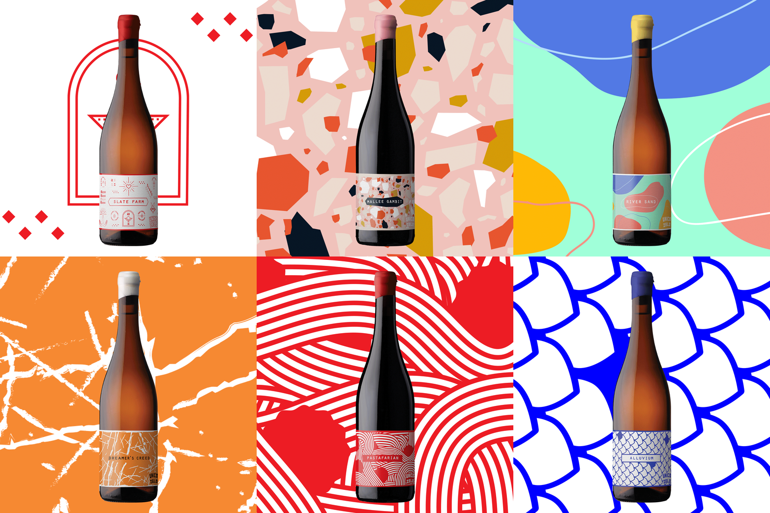
Did you know there are stories behind the untamed wine label designs?
That’s right, these beauties weren’t created to just “look good”, they were created to portray ideas, feelings and experiences. Before you read the descriptions below, pick your favourite from looks. Then read the descriptions and see if your opinion changes. No matter what you end up picking, you’re always going to have good wine!

Slate Farm
With Mexican food being the natural paring for the zesty but luscious tropical palate of slate farm, The label reflects the culture around Mexican Street food and taco trucks. Iconography heavy with almost a graffiti like element, but leaning towards the fun and jovial energy that this wine evokes. We played around with the Icons you often see on street vendors stalls, but frames in a lens of Australia and very wine focused, without sacrificing frivolity.

Alluvium
With Alluvium being a tightly wound expression of minerality, salinity and high acidity, the wine itself needs no interruptions as far as flavour, as the clear and defined flavours of Japanese food being the ideal match for this wine. With Sashimi and high end Sushi's clean flavour being the lead inspiration, the fishscale mosaic pattern is a clear link to the dining experience best suited for this wine.

Panda Panda
This is the only Untamed label that links back to it's former self, as this wine has a small but passionate cult following - particularly in Japan. While at a trade event, we met a fan of our wine who had their face painted like the Panda that was inspired by the Rueben Ireland art that previously adorned the label. With the precise nature of this wine due to the skill of crafting off-dry white wines, we stayed true to the inspiration from Japanese culture, using a bamboo forest - and of course, a panda nestled within - to portray the winemaking style and the fan history of this wine.

Halcyon Days
A wine built for beach parties at sunset and impromtu discos, a pretense free, plush, fun and chillable wine. Reflecting this, we we're inspired by beach clubs in Bali and Miami, with very leafy and coral patterns across the label, almost reminiscent of an underwater disco.

Mallee Gambit
A perfect match for any kind of food that has seen a lick of fire and smoke, and food cooked over coals. We took inspiration from the cuisine that use coals most often: Arabic, African and Middle Eastern foods, and taking their mosaic and stone patterns - particularly from Morocco - turning the colours up to 11 to almost reflect a marble counter top.

Pipe Dream
With Pipe Dreams luscious palate weight, it feels like a wine that you almost should't be drinking. We immediately thought of foods we shouldn't be eating and our minds sprung to Momofuku Milk Bar, and their outrageous pastries and sweets, filled with wonder and exubrance. With a wine that's perfect for celebrating, we covered the label with all the things that should be on the top of a birthday cake: jimmies, hundreds and thousands, in bright colours almost like confetti.

Pastafarian
With Nebbiolo being the ultimate wine for red sauce pasta, we took the label design very literally for Pastafarian. It's quite literally a bowl of spaghetti and meatballs.

River Sand
A wine best enjoyed under blue skies, we drink River Sand no matter the ocassion. The label reflects calm, sandy beach sunny days with soft colours fitting for lunching with wine, whether it be a picnic in the park or fish and chips on the beach.

Dreamer's Creed
With Dreamer's Creed being one inspired by one of the most ancient styles of making wine in amphora/qvervi, which were literally buried underground, we wanted to capture the gritty and raw nature of this wild wine. Inspired by grunge, goth and doom metal albums and natural gritty phemenons (granite marbling, lightning), we created a label that speaks to that inspiration but doesn't shy away from the wine that is in the bottle - a dogmatic approach to skin contact and orange wine.


